BRANDING

My creative approach to branding starts with research—where I happily go down rabbit holes most people avoid. I spend serious time here because great brands aren’t born from guesswork and good taste alone; they’re reverse-engineered from understanding what makes people tick. I dissect the target audience, uncovering their quirks and desires, which becomes the secret sauce for crafting a brand identity that’s both visually magnetic and strategically sharp. By letting research lead the creative charge, every brand element lands with precision, speaking to the right people in a language they didn’t know they were waiting to hear.

NAOMI LION

Naomi Lion is a boutique sports and events agency with two core

businesses: Events and Consulting.


The Challenge:
The primary challenge was to create a sophisticated brand identity that positions Naomi Lion within the luxury tier of sports and events agencies while authentically incorporating the lion as a symbol of their fierce expertise and uncompromising standards.


The Result:
The final brand identity successfully communicated that working with them isn’t just hiring an agency; it’s gaining access to an exclusive level of expertise, connections, and execution that transforms events from transactions into unforgettable experiences.

DELIVERABLES
Brand Guideline, Logo Package, Print Materials

Arial Regular
ABCDEFGHIJKLMNOPQRSTUWXYZ
abcdefghijklmnopqrstuwxyz
1234567890!@#$%^&*()_+

Arial Regular
ABCDEFGHIJKLMNOPQRSTUWXYZ
abcdefghijklmnopqrstuwxyz
1234567890!@#$%^&*()_+

Playfair Display Medum ABCDEFGHIJKLMNOPQRSTUWXYZ
abcdefghijklmnopqrstuwxyz
12344GYV90!@ $%ˆP✲()_+

Playfair Display Black ABCDEFGHIJKLMNOPQRSTUWXYZ
abcdefghijklmnopqrstuwxyz
1234567830!@ $%^&*()_+

Pantone: Black 6 C
CMYK: 60/40/40/100
RGB: 0/0/0
Hex: 0

Pantone 7556 C CMYK: 4/30/95/24 RGB: 183/139/32
Hex: B78B20

Pantone: 2592 C CMYK: 52/93/0/0
RGB: 155/38/182
Hex: 9B26B6

GEORGE ROBINSON REBRAND

George Robinson Surf Designs is among the few remaining East Coast Florida surfboard companies crafting eco-friendly balsa wood surfboards.


The Challenge:
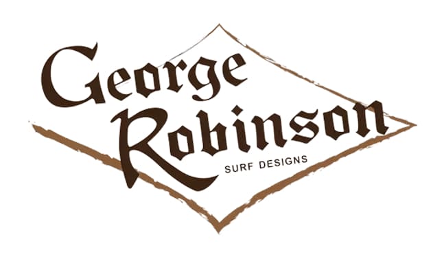
George Robinson Surf Designs’ 1980s-era logo, with its vintage colors and generic pirate typography, failed to communicate the brand’s commitment to sustainability. The outdated identity didn’t Resonate with eco-conscious consumers or reflect the innovative, environmentally friendly balsa wood surfboards the company creates.


The Result:
We refreshed the brand identity using a natural color palette and distressed aesthetic that reflects the raw beauty of balsa wood. While modernizing the look to appeal to eco-conscious consumers, we preserved the iconic diamond shape and elements of the original pirate typeface to honor the brand’s five-decade heritage.

DELIVERABLES
Brand Guideline, Logo Package

USTA LEAGUE

The USTA League National Championships is the culminating tournament for the United States Tennis Association’s recreational league tennis program.


The Challenge:
Design a championship mark celebrating the 40th anniversary of USTA League with a throwback 1980s theme. The visual identity needed to evoke the era’s iconic retro aesthetic—think Miami Vice neon pastels meets Galaga’s pixelated energy—while staying within the United States Tennis Association’s brand guidelines.


The Result:
Record-breaking merchandise sales. By targeting the demographic with a subbrand that defied traditional tennis aesthetics, the 1980s throwback theme drove unprecedented demand and proved tennis branding could successfully break from convention.

DELIVERABLES
Brand Guideline, Logo Package, Signage, Merch

MERCH COLLECTION